Slashbest’s mission is to simplify the consumer’s shopping journey by helping them make better & quicker shopping decisions and purchase with certainty and confidence.
Through an in-depth user research process, we identified the need for dividing experiences according to the user’s nature, the type of product and the price range. Two main experiences may be encountered by users - one that encourages research and deepening, and the other that gives a short, unhesitating answer.
/BEST VS. FAST
Playful & Gamified Shopping Experience
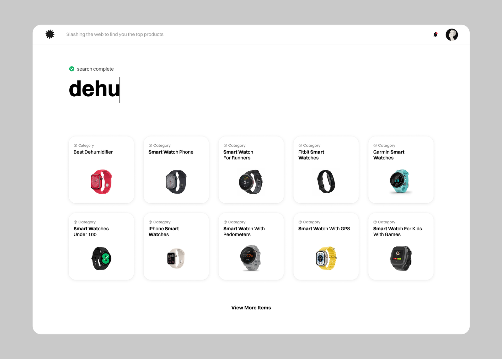
After user testing revealed a desire for a simpler, quicker search process, we streamlined our interface for faster, simpler product searches while ensuring detailed insights remain accessible. Our system now offers both a comprehensive exploration mode and a quick-scan option, maintaining a fun, playful and engaging shopping experience.
/FIND THE BEST PRODUCT
Problems
One size doesn't fit all: The existing interface treated all shoppers the same way, forcing everyone into the same long journey.
Research fatigue: Users who wanted to dive deep and compare data felt they didn't get enough detailed insights easily.
Decision paralysis: Users who just wanted a quick, trusted answer got overwhelmed by too much information and hesitated to buy.
Drop-offs: A lot of visitors left the site because the journey didn't match their immediate shopping state.
/FIND THE BEST PRODUCT
Design goals
The main challenge wasn't just fixing the UI, but creating a system that could serve two completely opposite types of shoppers at the same time, without making the screen feel messy or crowded.
A twin experience: Design a hybrid interface that gives a short, unhesitating answer for fast buyers, while keeping detailed insights accessible for researchers.
Simplicity: Streamline the core search and discovery process so it feels quicker, lighter, and much more intuitive.
Engagement: Keep the overall shopping vibe fun, playful, and interactive to turn casual visitors into confident buyers.
/FIND THE BEST PRODUCT
Solution & Impact
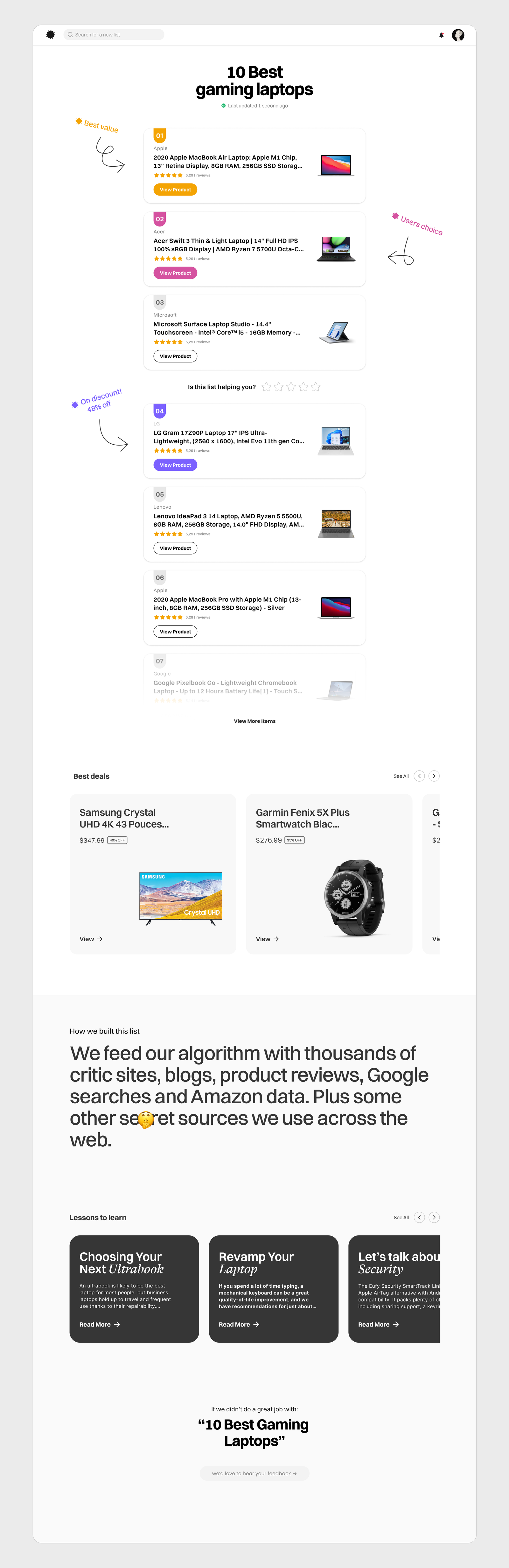
The Fast-Scan Mode: A frictionless, clean interface for shoppers who want an instant recommendation. They can see the best choice immediately and checkout without hesitation.
The Exploration Layer: An on-demand deep-dive view for researchers. With a simple action, they can unlock comprehensive data, comparisons, and insights without leaving the clean flow.
The new hybrid UX successfully eliminated the friction in the shopping journey, making it much easier for users to make decisions fast and buy with confidence.
Qualitative feedback from user testing showed that splitting the experience dramatically reduced hesitation and made the entire process feel fun and simple.
Slashbest’s mission is to simplify the consumer’s shopping journey by helping them make better & quicker shopping decisions and purchase with certainty and confidence.
Through an in-depth user research process, we identified the need for dividing experiences according to the user’s nature, the type of product and the price range. Two main experiences may be encountered by users - one that encourages research and deepening, and the other that gives a short, unhesitating answer.
/BEST VS. FAST
Playful Shopping
After user testing revealed a desire for a simpler, quicker search process, we streamlined our interface for faster, simpler product searches while ensuring detailed insights remain accessible. Our system now offers both a comprehensive exploration mode and a quick-scan option, maintaining a fun, playful and engaging shopping experience.
/find the best product
Problems
One size doesn't fit all: The existing interface treated all shoppers the same way, forcing everyone into the same long journey.
Research fatigue: Users who wanted to dive deep and compare data felt they didn't get enough detailed insights easily.
Decision paralysis: Users who just wanted a quick, trusted answer got overwhelmed by too much information and hesitated to buy.
Drop-offs: A lot of visitors left the site because the journey didn't match their immediate shopping state.
/find the best product
Design goals
The main challenge wasn't just fixing the UI, but creating a system that could serve two completely opposite types of shoppers at the same time, without making the screen feel messy or crowded.
A twin experience: Design a hybrid interface that gives a short, unhesitating answer for fast buyers, while keeping detailed insights accessible for researchers.
Simplicity: Streamline the core search and discovery process so it feels quicker, lighter, and much more intuitive.
Engagement: Keep the overall shopping vibe fun, playful, and interactive to turn casual visitors into confident buyers.
/find the best product
Solution & Impact
The Fast-Scan Mode: A frictionless, clean interface for shoppers who want an instant recommendation. They can see the best choice immediately and checkout without hesitation.
The Exploration Layer: An on-demand deep-dive view for researchers. With a simple action, they can unlock comprehensive data, comparisons, and insights without leaving the clean flow.
The new hybrid UX successfully eliminated the friction in the shopping journey, making it much easier for users to make decisions fast and buy with confidence.
Qualitative feedback from user testing showed that splitting the experience dramatically reduced hesitation and made the entire process feel fun and simple.